The Story
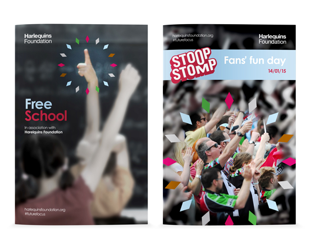
Detail were asked to create a brand for Harlequins Foundation. With a long standing commitment to its community, its Members and its history, Harlequins established the Harlequins Foundation in January 2015. The main objective of the Harlequins Foundation isto enable young people to achieve a brighter future. This will be attained through a combination of grant giving, scholarships and project delivery across local, National and Global programmes.
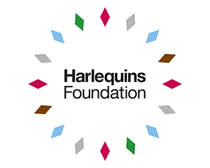
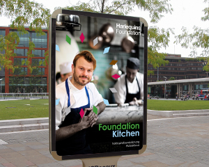
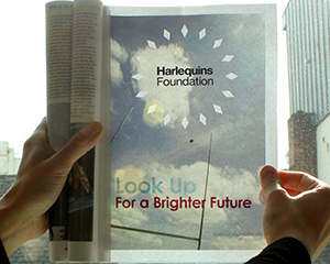
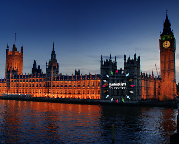
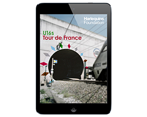
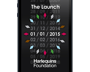
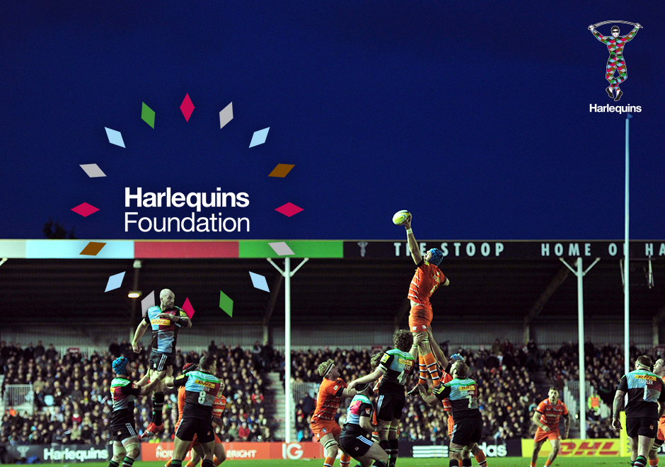
To create a graphic link between Harlequins and Harlequins Foundation we took the diamond shape from the Harlequin’s costume and laid out diamond shapes to symbolise the sun’s rays and – in turn – the Foundation’s vision: To enable youth to achieve a brighter future. The brand identity also visually represents the Foundation’s mission: To develop a global network who remain closely linked to the club and each other.
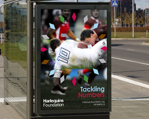
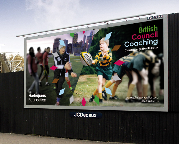
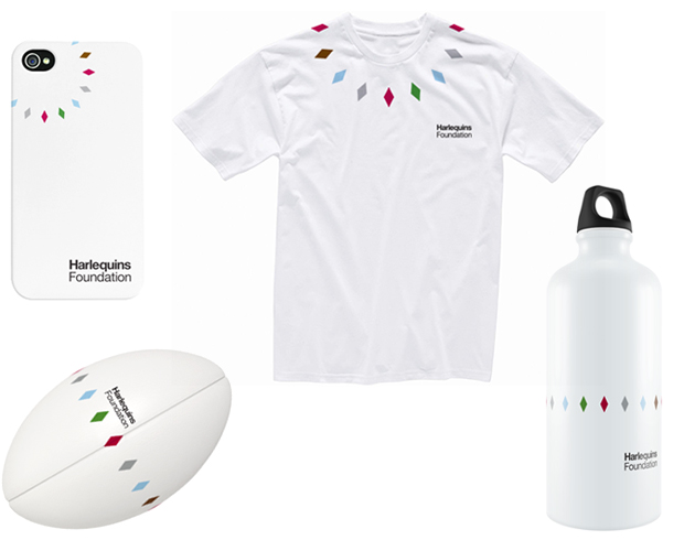
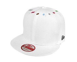
Symbolising a burst of energy and a united network, the brand uses Harlequins’ colours to harness the club’s spirit. The identity comprises two elements: the Harlequins Foundation logotype and the ring of diamonds which we call the Focus Finder. The logotype and Focus Finder can be used together as the identity lock-up, or separately from each other allowing the Focus Finder can draw focus to a particular area of a communication.
The Deliverables
– Brand identity
– Brand guidelines